Understanding the Mode – Statistics 101

Understanding the mode is important. The mode, or the most occurring value in a data set, is a commonly used descriptive statistic that is especially useful when working with nominal or categorical data.

The video below provides a brief overview of what the mode is, answers to frequently asked questions (FAQs) about the mode and gives real world examples of using the mode.

The mode is different than the mean (average) and median. The mode is the most occurring value whereas the mean is the sum divided by the number of observations in the data set and the median is the middle number in the data set when the data is put into order by size, from smallest to largest.

All of the data in the data set has to be in or converted to the same unit of measurement in order to find the mode.

There can be more than one mode in a data set. Some data sets may have multiple values that occur the most.

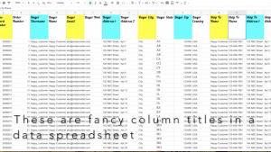
Watch the above video to see how the mode is used to find the state(s) with the most customer orders in the e-commerce store example, and how it’s used to in the plant nursery/garden store example to identify the type of flower or plant that survey respondents like to give as gifts.

In conclusion, the mode is useful in a variety of different types of data sets in a variety of different scenarios across many industries. Refreshing your understanding of this basic descriptive statistic will help you use it in ways that are useful to you and your organization.

Do have any examples of how the mode is useful in analyzing data for your work or in your life? Share your example in the comments below!

Why It’s Useful to Show the Incidence Rate per 10K or per 100K Population Instead of Just Number of Cases

Incidence rates, or the rates of new cases of a disease, are often shown as the rate per either 100,000 population or per 10,000 population, and provide valuable additional insight to the number of new cases of the disease.

In scenarios when comparing the incidence of a disease across different localities that have varying different sizes in population, looking at the incidence rate of that disease per 10,000 or per 100,000 population helps to show a more complete picture than would only looking at the number of new cases alone.

Examples are given in the quick, 3 minute video below to further illustrate this point.

In conclusion, showing the incidence rate per 10,000 or per 100,000 population provides additional valuable insight in addition to showing the number of new cases of the disease. This is especially true when comparing the incidence rate of the disease across different localities that have varying sizes in populations. In addition, looking at the incidence rate per population is essential when comparing that rate to a state or national average for that disease or comparing it to a benchmark or goal that is in the format of an incidence rate per population.

4 Things to Avoid with Data Spreadsheet Column Titles

Avoiding these 4 things in data spreadsheet column titles, as discussed in the quick (3 minute and 38 second) video below and in this post, will make it easier to analyze the spreadsheet data using programs like R or SAS or importing the spreadsheet data into a database.

(1) Avoid fancy formatting

Avoid fancy formatting in the column headers when the spreadsheet is going to be imported into a program such as R or SAS for analysis. 

Fancy formatting such as making words bold, italic, or adding colors can cause errors or even prevent the data from being able to be imported until the formatting is reverted back to plain, unformatted column headers.

Watch the video above to see examples of fancy and plain column headers.

Avoiding using fancy formatting in the first place will save your consultant or analyst time from having to change the formatting back to plain.

data analysis spreadsheet formatting

analyst consultant consulting agency laptop data

(2) Avoid inconsistent naming conventions

Avoid inconsistent naming conventions for titles and also avoid using special characters such as exclamation points(!), asterisks(*), at symbols (@), and other such symbols in the title of the column header.

For one it can be confusing. Also, special characters in the titles can cause errors in analysis or importing the data into a database. 

For an example of a spreadsheet using inconsistent naming conventions and special symbols in the column headers watch the video above.

(3) Avoid using really long descriptive titles

Avoid using long descriptive titles with spaces in between the words. Shorter titles are easier to analyze. Some software programs can’t recognize titles that have spaces between the words as variables. This will result in error messages or a failure to import the data.

Shorten the titles using codenames for those variables.

For an example of really long descriptive titles being shortened into code names, watch the video above.

Shortening codenames leads to the 4th thing to avoid in column title headers:

(4) Avoid forgetting to include a code book or some kind of documentation of what code names you shortened the long descriptive titles into

Don’t forget to include a code book or other similar documentation for long descriptive column titles that you’ve shortened the name of.

When working with a team no one else will necessarily know what that code title means and if you don’t document it somewhere, then you may even forget what it was yourself.

By avoiding fancy formatting, inconsistent naming conventions, using really long descriptive titles, and forgetting to include a codebook or other documentation you will make it easier and more efficient to analyze the spreadsheet data using programs like R or SAS or importing the spreadsheet data into a database.

Visualizing Population Data & Change in Population in Tableau

Population data and the percent change in population are two demographic measures that are great to look at for a variety of different reasons.

There are many different ways to visualize these two measures, depending what it is that you want to learn from this data or show to others in a presentation. In this post and in the video we demonstrate two different ways to do so using Tableau.

One way is to display the population data on a map. This is helpful especially if geography is important to what you are working on with this population data. For example if you are presenting different population sizes of different cities to a group of stakeholders who are not familiar with the locations of those cities or how far away or close to each other they are, then visualizing this on a map for them can help show this to them.

The percent change in population can also be visualized on a map. However, a better way to show percent change in population could be a bar graph.

The second way to display population data is with a bar graph, such as the bar graph shown in the video below for population change in 5 East Coast cities of Atlanta, Boston, New York City, Richmond (VA), and Washington D.C.

As you can see in the video, the interactive bar graph created using Tableau makes it easier to see which city had the greatest population change over the two five year periods looked at in this data set. 

Three Minute Tuesday Videos by RILLIAN, a consulting agency, briefly cover a topic in approximately 3 minutes or less. These videos are provide brief overviews of topics that are useful for anyone working in the areas of Research & Insights Leading to Learning, Innovation, And actioN (R.I.L.L.I.A.N.).

Are there any helpful tips you would like to add about visualizing population data or population change data in Tableau?

Do you have any suggestions for topics you would like to see us cover in our Three Minute Tuesday videos?

Email Jillian at Jillian.Regan@RILLIANconsulting.com .

quality improvement strategic planning

Systems and Software for Six Sigma Projects: Review of SixSigma Guide Software

Six Sigma is a quality improvement methodology that organizations in many different fields utilize to improve their organization’s processes and performance.

A systematic way for keeping track of Six Sigma projects is essential to being able to effectively use Six Sigma to improve the processes and performance of the organization. It is also important that this system is standardized throughout the organization and that all employees who will be using it are trained on how to correctly use it.

A good system will include a way to decide if the problem identified is enough a problem to be addressed in a Six Sigma project, before proceeding to conducting a Six Sigma project. In addition there should be a way to track both the impact of the problem and solution on the customer (voice of the customer) as well as on the business (voice of the business). It is important to document attributes of the data that is to be collected, such as if it is ordinal scale or nominal scale, to make it easier to keep track of which types of statistical analysis are appropriate to apply to the data.

One way to have a good system for Six Sigma projects could be to use a software program specifically designed for this, such as SixSigma Guide. SixSigma Guide is a software guide designed specifically for Six Sigma Projects.

quality improvement strategic planning

The homepage for SoftLogic, with SixSigma guide on the far right and two other software programs on the left and middle.

About SixSigma Guide:

  • It was created by Dr. Reiner Hutwelker
    • He is a business consultant,
    • Master Black Belt in Six Sigma,
    • and an adjunct professor at Hochschule für angewandte Wissenschaften München and Management Center Innsbruck in Eresing, Germany.
  • More details about the software can be found here (orginal website is in German-will need to have your browser translate it): http://www.softlogik.de/p_sigmaGuide_description_de.html
  • There is a trial version of this software available at http://www.softlogik.de/p_service_download_de.html
  • Note: this software tool does not provide the statistical analytic capabilities needed in most Six Sigma projects, so a statistical software program like R, SAS, Minitab, or Stata can be used for statistical analysis of the data in conjunction with this software tool

Review of SixSigma Guide:

  • This software is a useful and practical tool, although it may not be the right fit for every organization. It was clearly developed by a Master Black Belt in Six Sigma who used his many years of practical experience in conducting Six Sigma projects as well as in educating future Six Sigma quality improvement professionals. This software is relatively easy to learn how to use for people who are familiar with other software like Microsoft Excel. One of the best things about it is that it walks the user, step by step through the whole Six Sigma DMAIC (Define, Measure, Analyze, Improve, Control) cycle. Instead of having all these steps and sub-steps saved in different spreadsheets in folders on a shared drive, with this software, everything can be kept track of in one place.
  • While it is functional and relatively user friendly, I feel that in order to be more marketable the design of the user interface might need to be enhanced. While it is perfectly functional, people have become used to seeing beautifully designed software programs. Large organizations may also wish to be able to customize it with their logos and branding when implementing it across the organization.

quality improvement

A screenshot of the download page to download the SixSigma Guide software. The option to download the free trial is listed first. Both English and German slides with examples of using the software for a Six Sigma project are linked below the download link.

Another way could be to use a combination of different types of software the organization is currently using, such as Microsoft Excel or Google Docs, combined with a file sharing system, such as a server or cloud based storage solution, such as DropBox, so that all stakeholders who need access to the projects can easily access it.

Whichever systems and software you choose to use, it is essential that it there is a systematic and standardized way of conducting and keeping track of Six Sigma projects across your organization.

I’d love to hear your thoughts! Have you used SixSigma Guide software or a similar software for Six Sigma projects? What do you think about it?

Disclaimer: This is an independent review of software, I am not sponsored in anyway by any of the software companies or individuals listed or reviewed in this article. None of the links are affiliate links. I am just sharing my thoughts about software that could be useful for Six Sigma projects. I learned of this software while taking an online course on Six Sigma, from the Technical University of Munich (TUM) in Germany and edX.org, in which Dr. Hutwelker was a guest lecturer.

Jillian Regan, MPH is a consultant at Rillian. She enjoys quality improvement using data to improve processes within the organization, so that the organization can better serve its clients, customers, patients, or others. Connect with her by email at Jillian.Regan@RillianConsulting.com or Twitter (@JillianReganMPH) or LinkedIn.

Follow Rillian on Facebook to get updates on articles like this one or updates about current projects, like a bicycling survey!