Contact tracing is a process of figuring out who has been in contact with a person who has been diagnosed with a communicable, infectious disease, such as COVID-19, contacting them to let them know they may have come into contact with a person who has the communicable, infectious disease, and informing them of their options for testing, treatment, care, and follow up.
This process is typically carried out through phone calls, although in the past as well as in some cases or reaching people who do not have phones it may have involved in person visits.
The person doing the contact tracing, called a contact tracer, informs the person they are calling or otherwise contacting, of testing options so that they can get tested to see if they have the disease. That is if testing is available for the disease in question.
The contact tracer also provides the person with how to prevent spreading the disease to others, information on where to get treatment — if treatment is available for that disease– and help the person understand the next steps that they should take with testing, preventing spreading the disease to others, and treatment.
For example, in the case of a COVID-19 exposure, this would include the contact tracer providing the person with instructions and support on how to self-isolate or self-quarantine, how to get tested if testing is available, and recommending what to do if their symptoms get worse, such as seeking medical care.
What should you do if a contact tracer calls or contacts you? By responding to them as quickly as you can, you can reduce the time it takes per person. If you have questions for them, such as if something they said was not clear to you, ask them. If they ask you questions, answer them as accurately as you can. Listen to and follow their instructions for testing, next steps, and preventing spreading the disease to others.
What if you’re looking for a job right now and you’re interested in becoming a contact tracer? A first step could be to learn more about the contact tracing process and make yourself more competitive when applying for a contact tracing job, such as by taking a free online course, such as the one offered by Johns Hopkins University’s Bloomberg School of Public Health, available at https://www.coursera.org/learn/covid-19-contact-tracing?edocomorp=covid-19-contact-tracing .
Good places to look for contact tracing jobs are state and local health departments websites, under the jobs or careers section, since contact tracing is conducted by these entities in most places in the U.S. In some localities, or in instances of large outbreaks of infectious diseases, some localities may outsource contact tracing to other organizations that have experience in this kind of public health work. If you know of an organization like this in your community, you could also check their website for job openings.
RILLIAN does not have any job openings for contact tracers. We did not get any contracts to be involved in the contact tracing or case investigation process.
However, we did create an activity tracker back in April 2020, to help reduce contact tracing time per person by logging symptoms, activities, and persons in close and frequent contact with. It is available for free from https://mailchi.mp/18d93948e8bc/rillian_activity_tracker_for_contact_tracing.
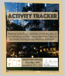
RILLIAN has developed a tool to reduce contact tracing time per person. You can download it here or by clicking the image above.
Let us know if you have any suggestions for topics in the areas of Research & Insights Leading to Learning, Innovation And actionN (R.I.L.L.I.A.N) that you would like to see us cover in our Three Minute Tuesday video series!
Email your suggestions to Jillian.Regan@RILLIANConsulting.com