The range is a descriptive statistic that is commonly used in reports, data dashboards, and more.
It measures the spread of the data, calculated by taking the difference between the lowest and the highest values in the data set.
Refresh your understanding of what the range is, learn the answers to a couple of frequently asked questions about the range, and a couple examples of how the range can be useful by watching the video below or continue to read the rest of this post.
As discussed in the video above, one frequently asked question about the range is if it is the same as the standard deviation. The answer to that is no, it is not. The standard deviation is how far the values are from the mean or average of the data set while the range is the difference between the lowest and the highest values in the data set.
Another frequently asked question is if the range could be a negative number. The answer to that is no, it can not be a negative number. It will either be a positive number because it is the difference between the highest and lowest values or it will be zero if all the numbers are the same in the data set.
One example of how the range could be useful is identifying outliers that are data entry errors in a health study.
Another example would be looking at the range of shipping costs using different packaging materials for an e-commerce store.
The above video goes into more detail for each of those two examples.
Refreshing your understanding of the range can help you to be more prepared to review and better understand data reports or dashboards including this descriptive statistic.
What is an example of how using the range would be useful in a data set from your work or in your life?
Understanding the mode is important. The mode, or the most occurring value in a data set, is a commonly used descriptive statistic that is especially useful when working with nominal or categorical data.
The video below provides a brief overview of what the mode is, answers to frequently asked questions (FAQs) about the mode and gives real world examples of using the mode.
The mode is different than the mean (average) and median. The mode is the most occurring value whereas the mean is the sum divided by the number of observations in the data set and the median is the middle number in the data set when the data is put into order by size, from smallest to largest.
All of the data in the data set has to be in or converted to the same unit of measurement in order to find the mode.
There can be more than one mode in a data set. Some data sets may have multiple values that occur the most.
Watch the above video to see how the mode is used to find the state(s) with the most customer orders in the e-commerce store example, and how it’s used to in the plant nursery/garden store example to identify the type of flower or plant that survey respondents like to give as gifts.
In conclusion, the mode is useful in a variety of different types of data sets in a variety of different scenarios across many industries. Refreshing your understanding of this basic descriptive statistic will help you use it in ways that are useful to you and your organization.
Do have any examples of how the mode is useful in analyzing data for your work or in your life? Share your example in the comments below!
Data and research can be very useful in making goals more specific using a data-informed SMARTER goal setting process.
SMARTER is an acronym for setting goals. Different organizations or individuals prefer slightly different words that make up the acronym, the most commonly used words are included below.
S = Specific
M = Measurable or Meaningful
A = Actionable, Achievable, Attainable, or Action-Oriented
As the video below discusses, making goals specific involves specifying the what, how, why, who, and/or where part of the goal.
As discussed in the above video, data can help provide actual, specific numbers of how your organization is currently doing in certain areas and provide a way to measure improvement as specified in the specific goal(s).
For example, marketing metrics such as the click through rate for ads, social media engagement rate, email open rate, data on customer demographics, and other such metrics are probably ones that your organization already measures and can give you very specific data on how well your organization is doing in these specific areas.
Research can provide additional insights such as emerging trends in your organization’s industry to use as a benchmark for your organization to strive towards. Additionally research can provide additional insights on the who, what, where, or how factor of the goal(s).
When using data and research to help set more specific goals it is important to keep several things in mind.
For one it is important to understand the data sources as well as the data sources’ limitations on how specific of data they can provide. The data can only be as specific as it is collected or entered into the data source. This also means that the goal can only be made as specific as you or your organization can find or create a data source to measure that data point as specifically as your organization would need it to be in order to track that goal.
For example, if using geographic data to track a goal such as increasing the number of customers in a specific city, the data source would have to provide the data at that same city level, not at the state or country level.
Also, it is important to specify units of measurement. For instance, a goal of increasing something by 5 times is a lot different than increasing it by 5%.
Additionally, it is important to know which units of measurement are provided in the data and which units would have to be calculated. For example if the data source provides time in minutes but the goal deals with time in hours, then a calculation will have to be done to convert minutes to hours.
Factoring in the time and/or resources it will take to measure progress towards the goal(s) with how specific that goal is or those goals are is another important thing to keep in mind. You want the goals to be as specific as it will be useful for them to be, but not too specific or more specific than is really needed. You do not want to waste time and/or resources tracking and calculating data to measure progress towards the goal(s) that is more specific than it needs to be.
RILLIAN is a consulting agency focused on Research & Insights Leading to Learning, Innovation And actioN (R.I.L.L.I.A.N).
If you or your organization needs assistance and support involving any of the above to achieve your goals, or if you or your organization is in need of assistance in setting and tracking your goals using data-informed or data-driven methods, contact us and let’s getting working on that together! Schedule a meeting, learn more about us, connect with us on LinkedIn, or watch our Three Minute Tuesday/Thursday video series on our YouTube channel.
Google Sheets can be used to calculate descriptive statistics for small data sets. However, with large data sets we recommend using statistical software made for analyzing large data sets, such as R, Tableau, SAS, STATA, SPSS, and other such software.
In the video below, we show how to calculate these seven descriptive statistics.
Mean (Average)
Median
Mode
Range
Standard Deviation
Coefficient of Variation
Z-Score
In conclusion, Google Sheets can be used to quickly and conveniently calculate descriptive statistics like the seven discussed in this article when working with small data sets.
Adding filters in Tableau helps you make your Tableau dashboards more useful. Filters allow you to display subsections of your data set in your dashboard.
One way to add a filter is to use one worksheet that you have in the dashboard as a filter for the other worksheets. To do this, select the filter icon in the menu that appears to the right of the worksheet when you have that worksheet selected.
Another way is to go to the drop down menu to the right of the worksheet, hover over “Filters”, which then brings up a drop down menu in which you can select which of the variables in the worksheet you want to use to filter by.
The video below shows how to do both of these methods for adding filters in less than 3 minutes.
As shown in the above video, adding filters to your Tableau dashboards can make your dashboards more useful and easier to display a selected subsection of your data set.
Planning out the details of how your organization will conduct a survey helps to make sure that conducting the survey is a good use of the organization’s time and resources and the results provide insight for answering the research question that was the reason for conducting the survey.
The video below briefly discusses 5 important factors to consider when planning a survey.
As briefly discussed in the above video, 5 important things to consider are:
Clearly defining what the research objectives are. Narrowing it down and getting specific about what it is that you want or need to know is important before conducting a survey.
Verifying that conducting a survey is the best way to go about answering your research objectives. Once your research objectives are clearly defined you can decide if a survey and not another method, such as a focus group, an in-depth interview, a secondary data analysis, etc. is the best method to use.
Deciding on or clarifying who is your target sample. Is there a certain demographic who’s opinion you want on this topic? For example, are you doing this survey as part of a community health assessment where you want a sample that’s representative of the population of the community or is it more narrow, such as if you’re conducting a customer satisfaction survey so you would want a sample of your customers to survey. Or do you only want a specific segment of those customers, such as those who purchased a particular product?
Deciding on your desired sample size taking into account factors such as the response rate you would expect to get, statistics such as the sample size you would need if you want a 95% Confidence Interval, or a 90% Confidence Interval, and other related factors.
Determining how you will conduct the survey based on the best way to reach your target sample to get them to complete the survey, the sample size you want, your organization’s budget and resources for conducting this survey, and other related factors.
Having a well planned out survey will ensure that your organization’s time and resources used to conduct the survey will be put to good use and that the survey results will provide valuable insight into what it is you were trying to find out through using a survey as a research method.
A few resources to get more information on planning a survey are:
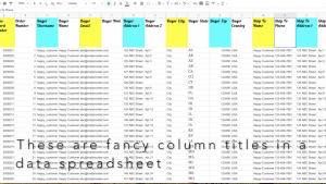
Avoiding these 4 things in data spreadsheet column titles, as discussed in the quick (3 minute and 38 second) video below and in this post, will make it easier to analyze the spreadsheet data using programs like R or SAS or importing the spreadsheet data into a database.
(1) Avoid fancy formatting
Avoid fancy formatting in the column headers when the spreadsheet is going to be imported into a program such as R or SAS for analysis.
Fancy formatting such as making words bold, italic, or adding colors can cause errors or even prevent the data from being able to be imported until the formatting is reverted back to plain, unformatted column headers.
Watch the video above to see examples of fancy and plain column headers.
Avoiding using fancy formatting in the first place will save your consultant or analyst time from having to change the formatting back to plain.
(2) Avoid inconsistent naming conventions
Avoid inconsistent naming conventions for titles and also avoid using special characters such as exclamation points(!), asterisks(*), at symbols (@), and other such symbols in the title of the column header.
For one it can be confusing. Also, special characters in the titles can cause errors in analysis or importing the data into a database.
For an example of a spreadsheet using inconsistent naming conventions and special symbols in the column headers watch the video above.
(3) Avoid using really long descriptive titles
Avoid using long descriptive titles with spaces in between the words. Shorter titles are easier to analyze. Some software programs can’t recognize titles that have spaces between the words as variables. This will result in error messages or a failure to import the data.
Shorten the titles using codenames for those variables.
For an example of really long descriptive titles being shortened into code names, watch the video above.
Shortening codenames leads to the 4th thing to avoid in column title headers:
(4) Avoid forgetting to include a code book or some kind of documentation of what code names you shortened the long descriptive titles into
Don’t forget to include a code book or other similar documentation for long descriptive column titles that you’ve shortened the name of.
When working with a team no one else will necessarily know what that code title means and if you don’t document it somewhere, then you may even forget what it was yourself.
By avoiding fancy formatting, inconsistent naming conventions, using really long descriptive titles, and forgetting to include a codebook or other documentation you will make it easier and more efficient to analyze the spreadsheet data using programs like R or SAS or importing the spreadsheet data into a database.